
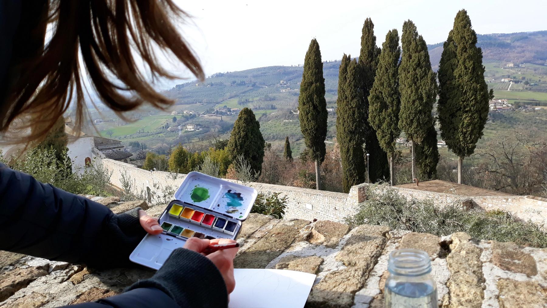
Alina Gallo MFA ’08 received her Master of Fine Arts in Studio Art from Maine College of Art & Design in 2008. In 2017, with her husband Giuliano Matteucci, she founded A. Gallo Colors, following a period of research into Timurid, Safavid, and Ottoman manuscripts in collaboration with the Metropolitan Museum Department of Islamic Arts, the Topkapi Palace Library in Istanbul, and the Museum of Art at Bowdoin College’s Islamic Manuscript Collection.

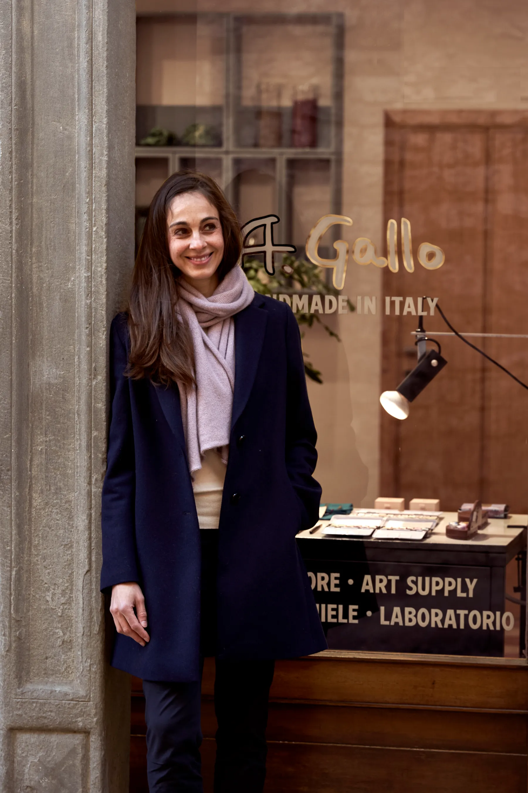
Alina Gallo in front of the A. Gallo Colors Showroom
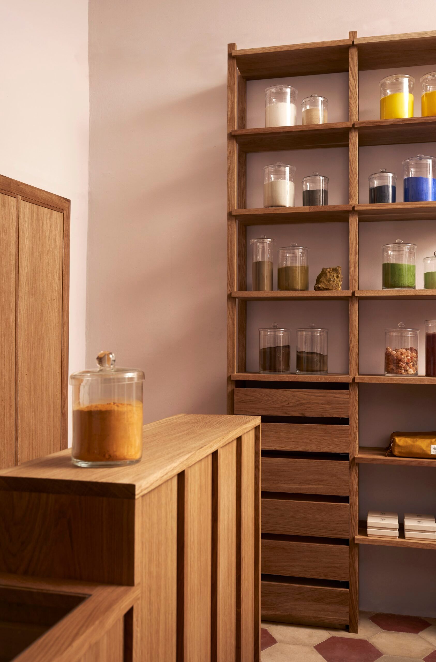
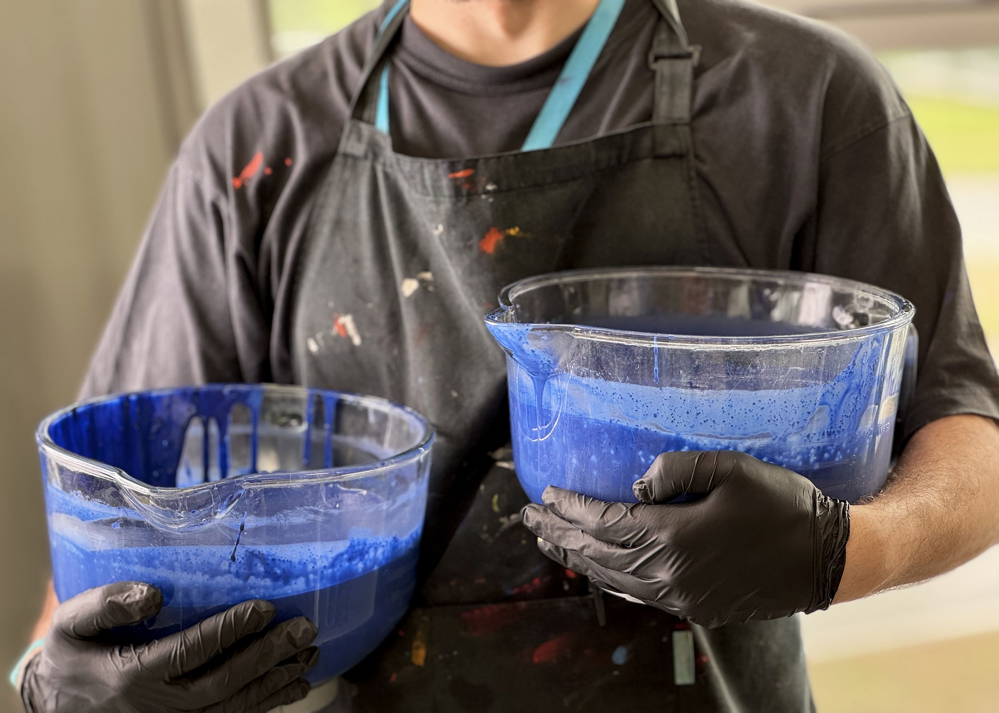
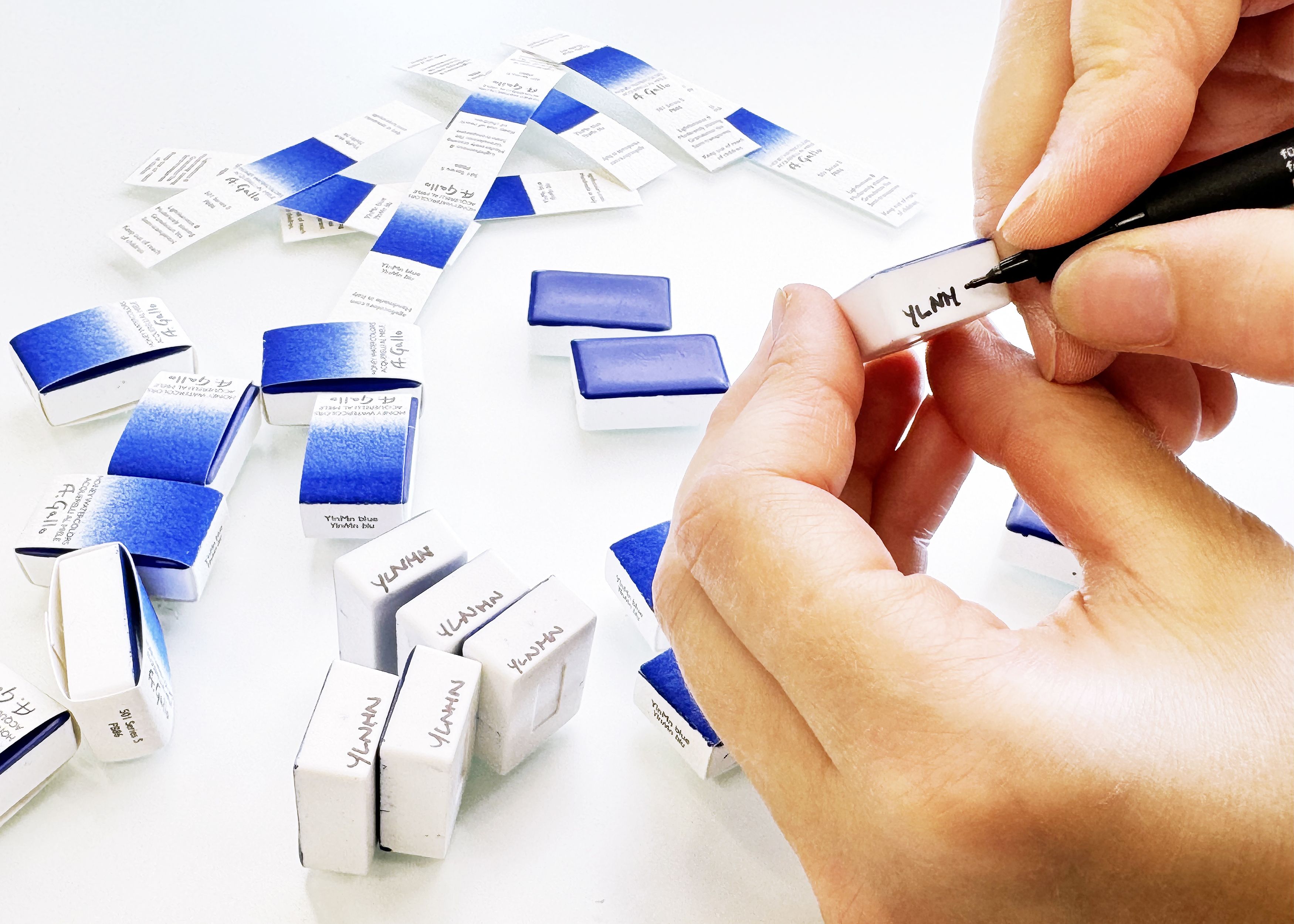
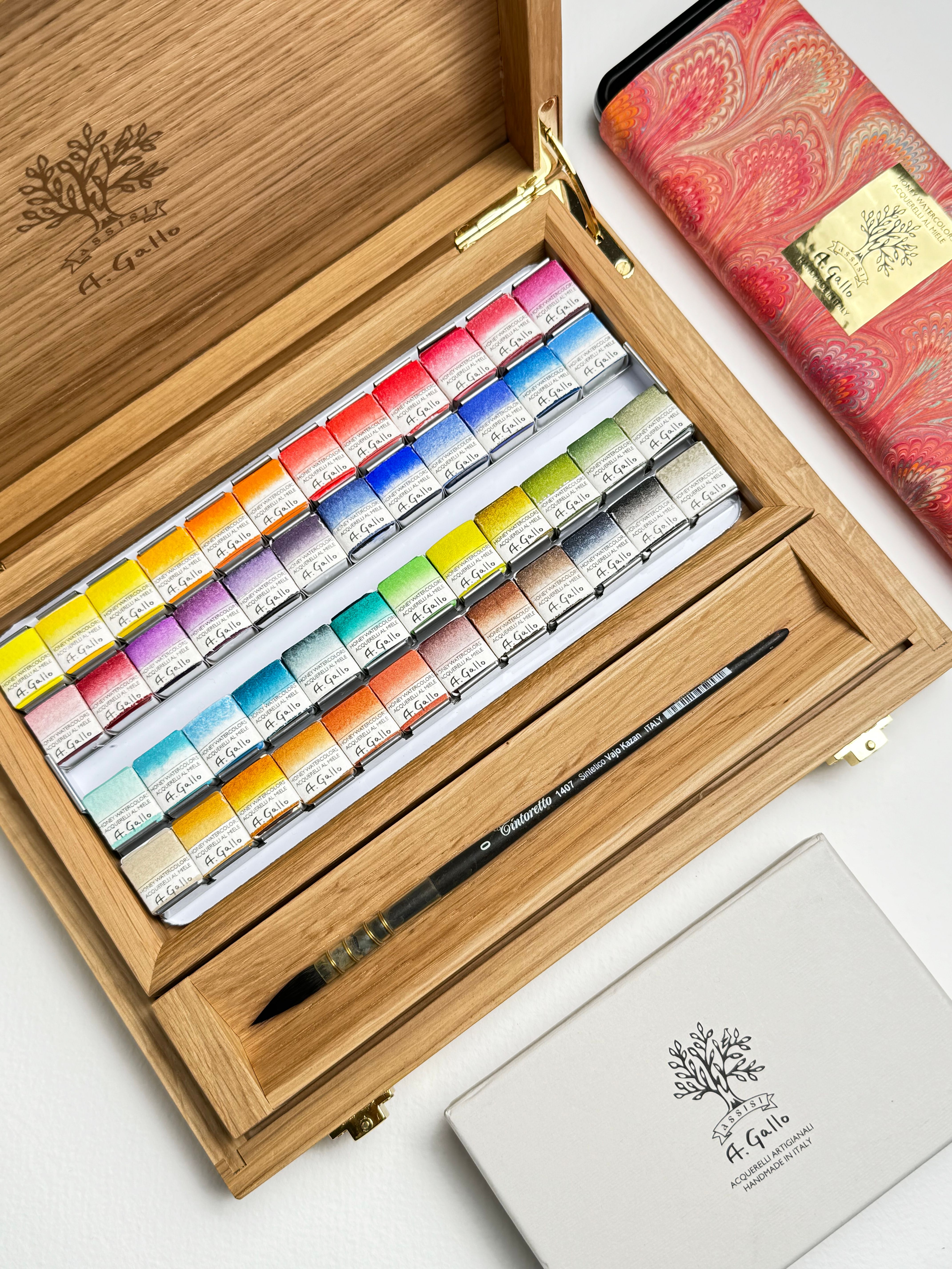
Handmade in Italy, A. Gallo watercolors are crafted according to a traditional recipe of raw pigments, gum arabic from the acacia tree, local honey from Umbria, and rosemary essential oil. Every batch of paint is made from premium pigments and hand-poured into pans. This intensive process creates a very pigmented, luminous, and pure paint with excellent lightfastness that activates beautifully when wet.
A. Gallo Colors Showroom and Atelier is located in Assisi, Italy, and their products are sold in specialty shops around the world, from Soho, New York, to London, Paris, Rome, and Madrid.
Can you tell us about your early relationship with art and color? What first drew you to painting?
As a child, I remember seeing colors very vividly in that space between waking and sleeping—flashes, fleeting patterns, shifting forms. It wasn’t tied to anything physical, which made it even more fascinating. That experience stayed with me. They were vivid and fleeting, and I think they gave me an early sense that color could be emotional, atmospheric, and alive on its own. I think it made me curious not just about how to use color, but what color actually is—something that exists both as a physical material and as a kind of internal perception, almost as if it has its own life, its own sort of agency.
What led you to pursue graduate-level study in art, and what were you exploring during your MFA at Maine College of Art & Design?
I pursued graduate study to better understand not just how to make work, but how it’s experienced; how materials, objects, and viewers interact on a more intuitive, pre-verbal level.
During my MFA, I was exploring non-representational dimensions, moments where color, material, or rhythm operate independently of what’s being depicted and the idea that meaning doesn’t exist in a fixed way, but emerges through encounter—through the emergent relationship between the viewer, the body, and the work unfolding over time. I became particularly interested in how even subtle shifts in material, repetition, or arrangement could shape perception.
That’s also when I began to think of color not just as something descriptive, but as a kind of language, or even a tool, something that actively constructs experience rather than simply illustrating it.
How did your education at MECA&D shape the way you think about materials and craftsmanship and prepare you for building your company?
My education and mentorship experiences at MECA&D really shaped how I think about both materials and making, not just in terms of technique, but in terms of meaning and experience. The training in critical theory taught me to question how things function, how they’re perceived, and what kind of relationships they create with the viewer or user. It gave me an interdisciplinary framework for interpreting how meaning is constructed and experienced.
At the same time, it helped refine my intuitive sensibility, learning to trust perception, while also being able to articulate and challenge it.
That way of thinking became foundational when building my company. I don’t see it as separate from my artistic practice. Creating a business is, in many ways, a creative act. The products are not just objects, but designed experiences.
So craftsmanship, for me, isn’t only about quality or tradition, but about how materials carry meaning, how they’re encountered, and what they evoke. Whether it’s a pigment, a brush, or a package, each element has the potential to shape perception.
In that sense, the brand itself becomes a kind of artwork, where every decision, from material sourcing to color to form, contributes to a larger experiential and conceptual whole.



Was there a specific moment when the idea for A. Gallo Colors began to form?
It wasn’t a single moment, but more of a gradual convergence. I had been thinking a lot about color as both a material and a perceptual experience, and was already working with traditional paint-making methods in my own practice. This led to a period of more focused research into historical techniques and materials, in dialogue with institutions such as the Metropolitan Museum of Art, the Topkapi Palace Library in Istanbul, and the Museum of Art at Bowdoin College.
A. Gallo Colors emerged from that intersection. In 2017, my husband, Giuliano Matteucci, and I founded the company in Assisi, building on an ongoing exchange between our practices—his as an artist and photographer, and mine rooted in material research and painting.
That dialogue took shape in a very specific context—the Umbrian hills, surrounded by the frescoes of Giotto and the natural landscape. It was a collaborative and iterative process in which ideas developed through constant exchange between us and the materials themselves.
From that, we began creating the first curated sets of watercolor, inspired by these traditions, while also rethinking how artists encounter and experience color today.
Did your artistic training prepare you for entrepreneurship—or did you have to learn an entirely new skill set?
My artistic training prepared me to build something. The ability to think critically, to work through uncertainty, and to shape an idea into a coherent experience translates directly.
The business skills we had to learn along the way, but the underlying mindset, the ability to see connections, make decisions, and build with intention, came from our training as artists.
In a way, the absence of a traditional business mindset at the outset was important. It allowed the project to begin without being driven by a bottom line. It started almost as an experiment, an attempt to understand what place handmade, artist-made tools might have in the contemporary world.
Why is it important to you to preserve traditional pigment-making techniques?
Because they carry knowledge that is both material and cultural. Through my research into historical paint-making traditions, I became very aware that pigments aren’t just colors—they’re tied to specific places, histories, and ways of working.
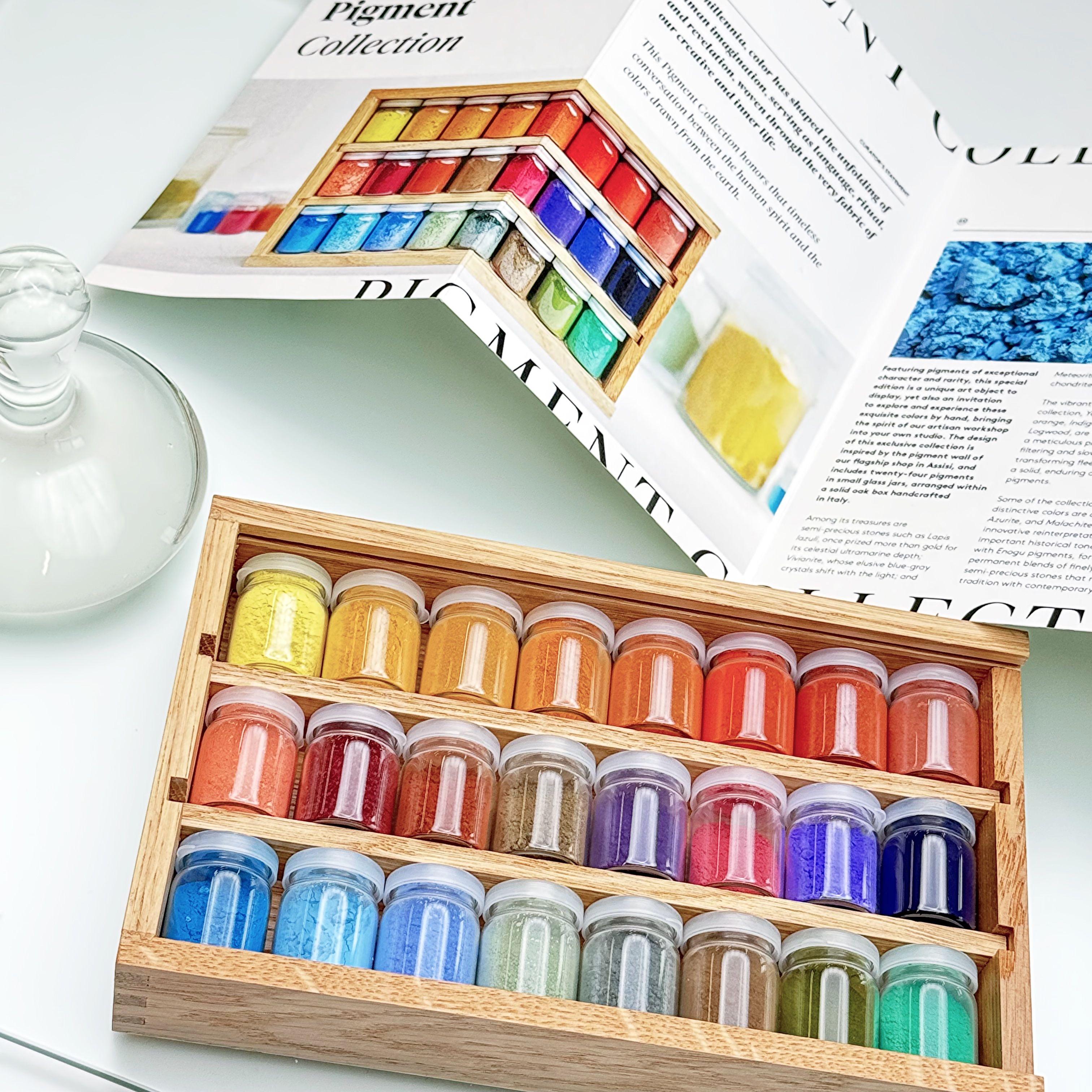
For millennia, color, drawn from the earth, has shaped the unfolding of human imagination, serving as language, ritual, and revelation, woven into the fabric of our creative and inner life.
Preserving these techniques is a way of maintaining that relationship to material. One that is slower, more intentional, and more directly connected to the origin of color.


How does handmade paint change the experience of painting for artists?
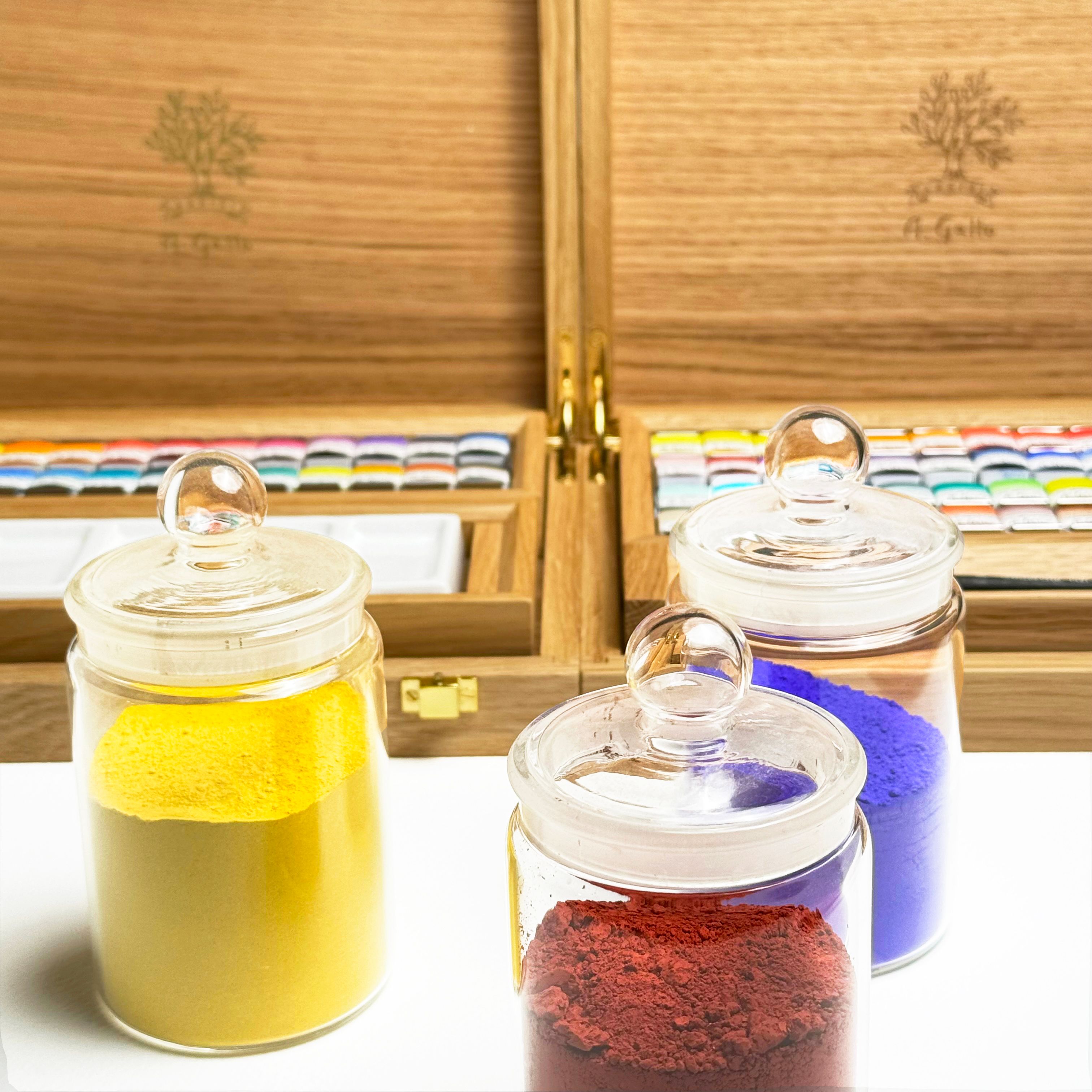
Handmade paint makes the material more present. Working directly with traditional recipes, you become very aware of how the color behaves, its personality, its consistency, how it moves.
That awareness shifts the relationship between the artist and the work. It becomes less about controlling the material and more about working in dialogue with it.
At the same time, it allows us to maximize pigment load and avoid unnecessary fillers or brighteners, so the material retains its full character. Because we work on a small scale, we can also be very nimble, producing artisan batches of exceptional pigments, such as ground meteorites gleaned in the Moroccan desert, violet lake pigment derived from logwood, or raw sienna from the historic quarry at Monte Badia.
Many of your palettes feel almost like art objects in their own right. How intentional is the design experience around the materials?
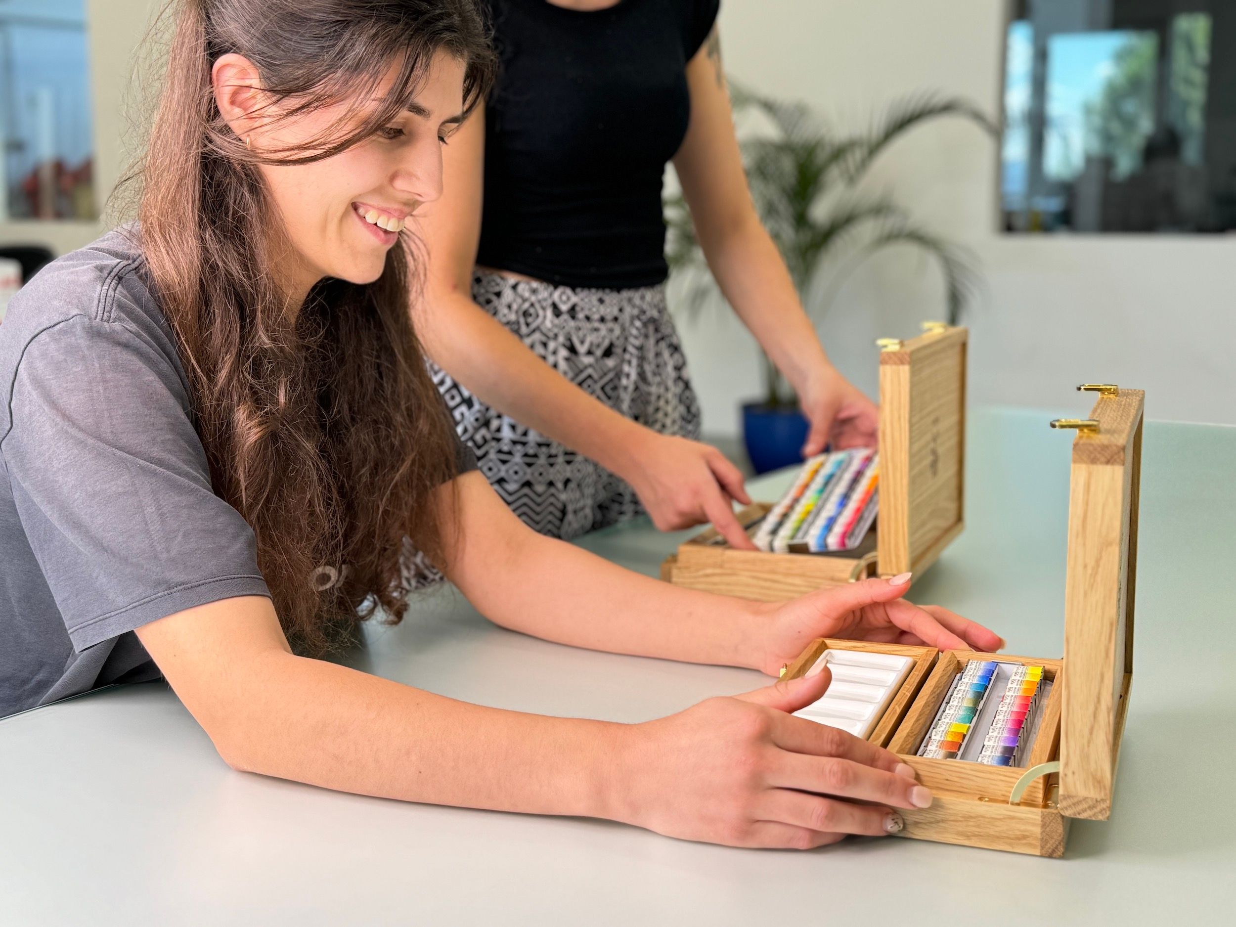
It’s very intentional. I think of each palette as an object of encounter, not just something functional, but something that shapes how you approach painting.
The arrangement, the materials, even the scale, everything is designed to slow you down and heighten your awareness. In that sense, the palette becomes part of the experience, not just a tool.
That extends to our collaborations with Italian artisans, from brush makers like Tintoretto in Arezzo to Florentine marbled paper studios trained in the sixth-generation workshop of Giulio Giannini e Figlio. The hand-painted labels on Fabriano paper, the marbled packaging, and the Fedrigoni paper box bring a kind of synergy and aura to the object, where different traditions of making come together. The palette becomes not just a container of color, but a convergence of materials, gestures, and histories.
What excites you most about the future of A. Gallo Colors?
What excites me most is the possibility of continuing to expand what a color practice can be: deepening our work with materials, developing new collaborations with institutions and pigment experts, and drawing on historical traditions while creating new ways for people to engage with color.
Recently, we’ve begun exploring this through a series of collaborations with cultural institutions. We created exclusive palettes for the Galleria Borghese, inspired by the permanent collection, including one based on Caravaggio’s original palette, and we’ve just begun working with the Museum of Fine Arts in Boston.
At the same time, we’re developing more material-focused projects, like a special edition of Yirrkala pigments, generously shared with us by the late Steven Patterson of Derivan and the Buku-Larrnggay Mulka Centre. These are historically significant natural earth pigments from the Arnhem Land region, used in indigenous Australian art practices and often connected to ancestral narratives of fire, water, and cultural identity.
Equally inspiring is the growth of our team. We are now around twenty people across production, our flagship store, and administration; many have been with us for years. It’s been incredibly rewarding to see them develop their skills, take on more responsibility, and refine their craft over time.
As an artisan business, we’re deeply committed to supporting the next generation through training in traditional techniques as well as an understanding of how those skills can exist within a contemporary, sustainable business. For us, it’s not only about preserving knowledge, but about creating the conditions for it to evolve and remain vital.
What advice would you give a young artist looking to break into the art world?
I would say: focus on developing a way of seeing, rather than trying to fit into a system.
Work with intensity and depth, build a relationship with your materials and your ideas that feels genuinely yours. Don’t be afraid to involve others, let go of ego.
And don’t be afraid to create your own context. Sometimes building something, whether it’s a project, a platform, or even a company, is a way of extending your practice rather than stepping away from it.
Alina Gallo’s Guide to Color & Inspiration
Favorite pigment color of all time?

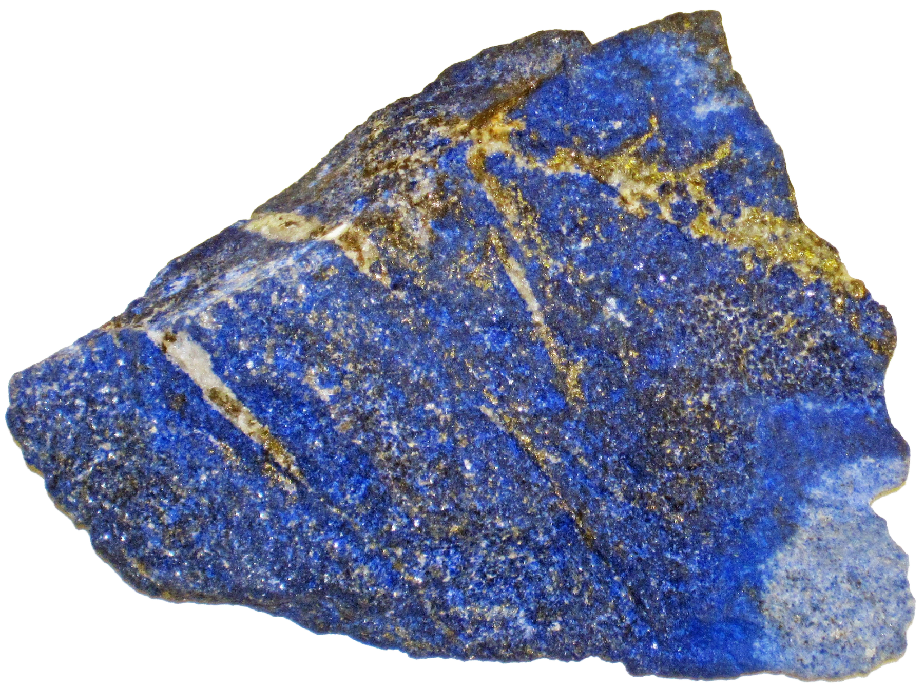
Lapis Lazuli
A color you think artists overlook?


Raw Umber. It carries a deep material history and has a quiet way of shaping temperature and transparency.
A favorite artist known for color?
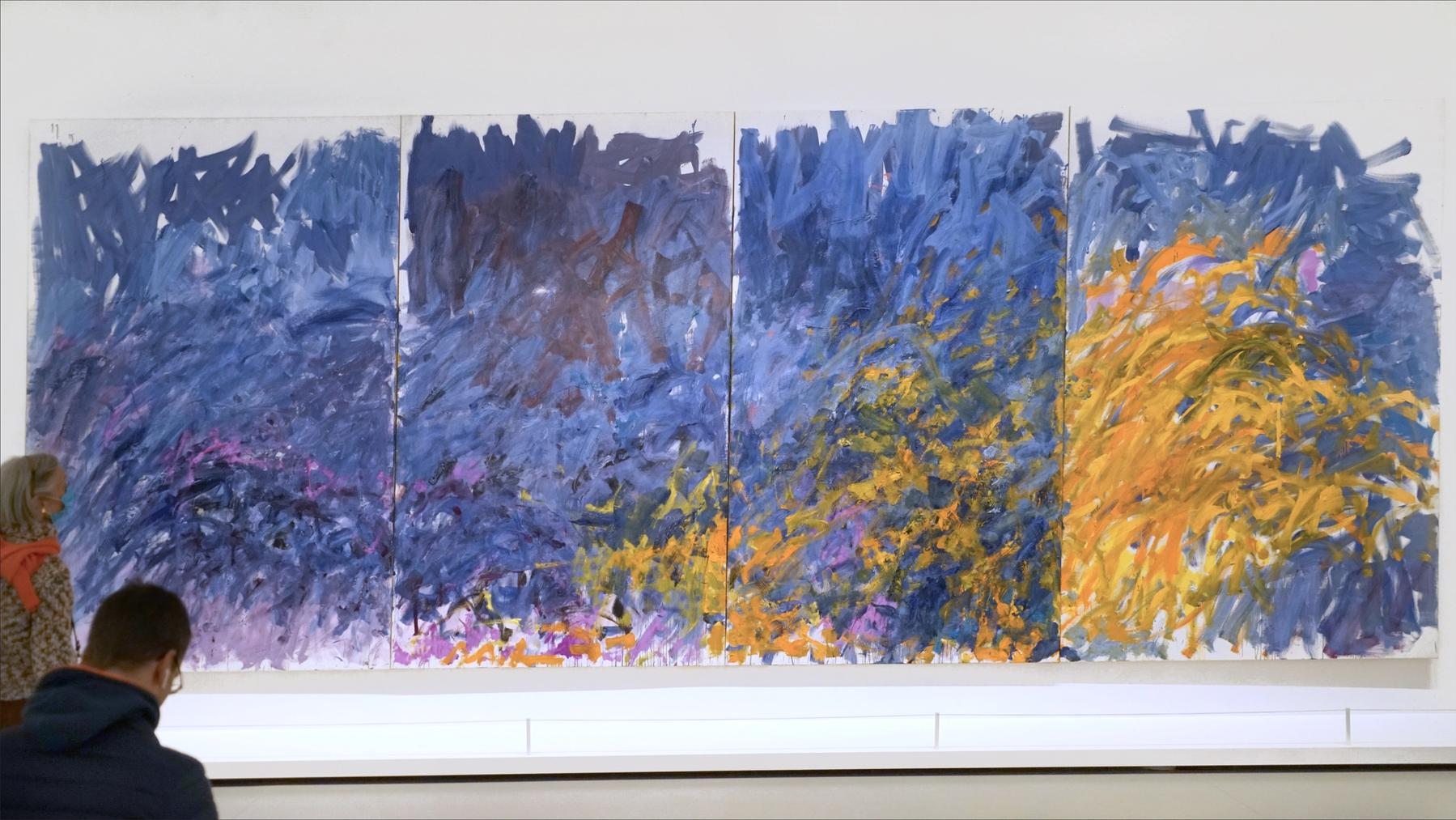
Oh gosh, do I have to pick just one? Katarina Grossei, Joan Mitchell, and Cecily Brown.
A beautiful design object?

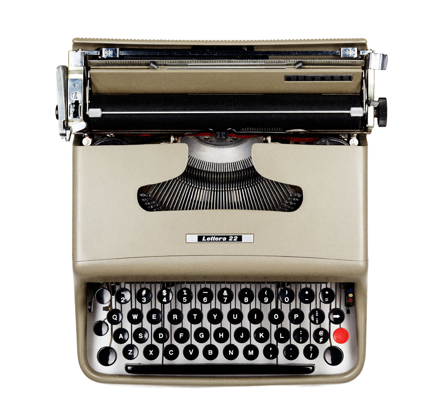
Olivetti Lettera 22 Typewriter
A book about color every artist should read?
Book of Earth by Heidi Gustafson
A color you think defines the present moment in art?


Pearlescent Gray
A historic or contemporary artwork with an incredible palette?

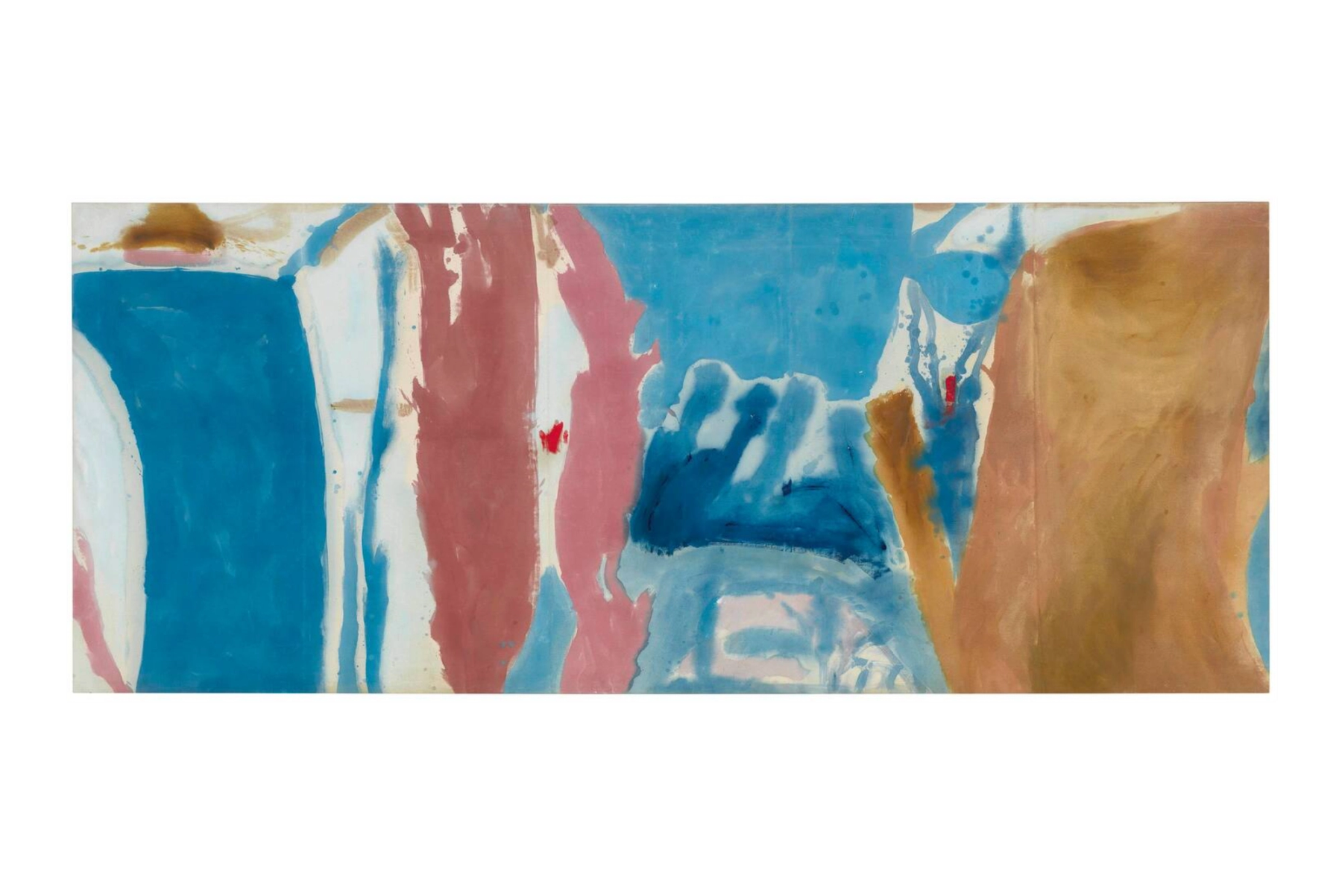
Open Wall by Helen Frankenthaler, 1953
A place in the world known for its colors?

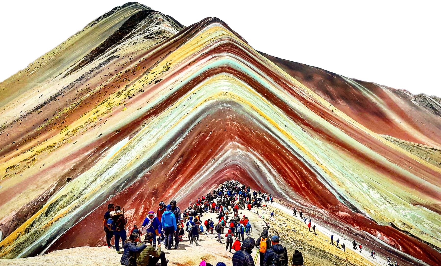
Vinicunca, The Rainbow Mountain in Peru
A gallery that consistently inspires you?
Hauser & Wirth
A museum that changed the way you see color?

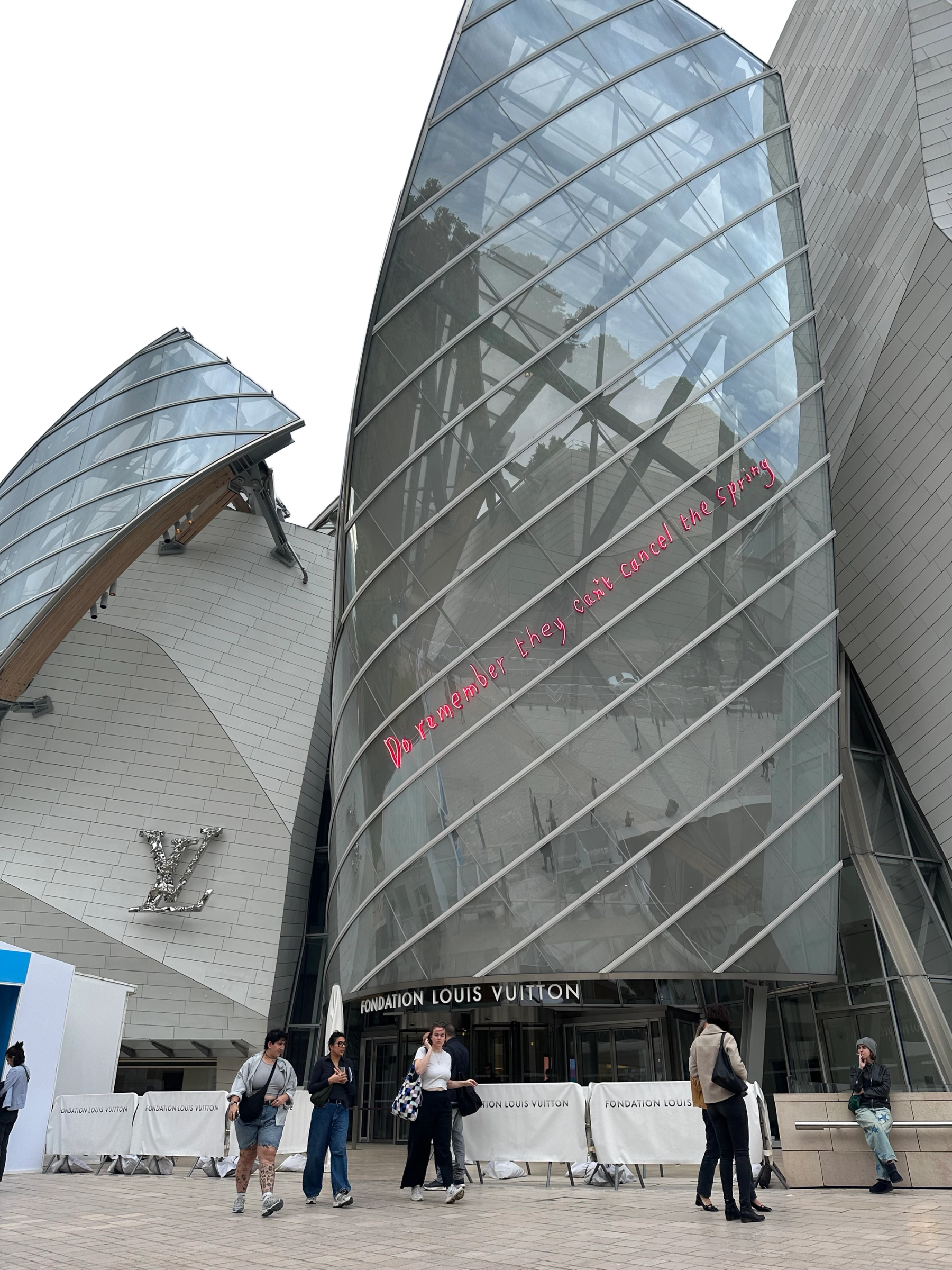
Fondation Louis Vuitton in Paris
Words by Leah Brooks.
Image Credits
“Lapis lazuli (lazuritic metamorphite) (Sar-e-Sang Deposit, Sakhi Formation, Precambrian, 2.4-2.7 Ga (?); Sar-e-Sang Mining District, Hindu-Kush Mountains, Afghanistan) 8” by James St. John, CC BY 2.0
Messeplatz with CHOIR installation by German artist Katharina Grosse at Art Basel 2025 CC BY 4.0
“‘Edrita Fried’ de Joan Mitchell (Fondation Louis Vuitton, Paris)” by Jean-Pierre Dalbéra, CC BY 2.0
“Cecily Brown, A Swan Comforting a Snake, Oil on linen” by Ali Eminov, CC BY-NC 2.0
"Olivetti Lettera 22 Typewriter Marcello Nizzoli" by Austin Calhoon, CC BY-SA 3.0
"Vinincunca - Montaña arcoiris" by EdsonFuentesMera, CC BY-SA 4.0
Helen Frankenthaler. Open Wall, 1953. Oil on canvas. 53 3/4 × 131 in. Kenneth C. Griffin Collection. © 2026 Helen Frankenthaler Foundation, Inc. / Artists Rights Society (ARS), New York